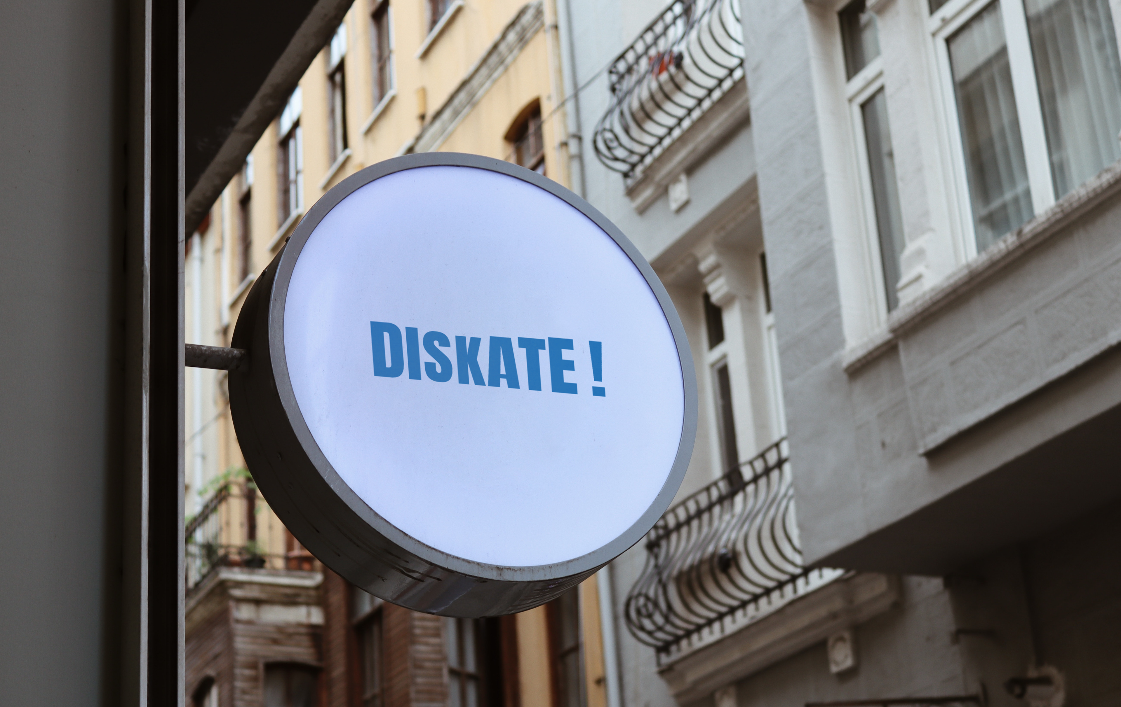

The skate shop logo takes inspiration directly from the culture of skating itself — the ramp. Instead of relying on generic imagery, the logo is shaped like a smooth quarter pipe, instantly recognisable to skaters and anyone familiar with skateparks. The ramp silhouette creates a bold and dynamic outline, symbolising movement, flow, and progression.
Typography is integrated into the design, either resting on top of the ramp’s curve (like a skater rolling over it) or built into the ramp shape itself, giving the shop name a sense of energy and motion. Sharp edges and clean lines emphasise toughness and durability, while the curve of the ramp adds balance and creativity.
The logo works well in both solid black and vibrant street-inspired colour palettes, making it versatile for signage, stickers, boards, and apparel. It conveys a lifestyle skateboarding’s mix of challenge, community, and freedom.